💥 TRENDING: Search/label/university - Full Archive

A public dumping ground for words and pictures. Contact me at [email protected]

Showing posts with label university. Show all posts

Sunday, 15 December 2013

Pagemages and Boozehorns


These were me getting back in the saddle after a while away. They started with the pose, pulling something out of a book. The scarf was to add a little character beyond generic wizardliness. The robes are lazy I confess. I too often go with shapeless full-length robes, but I think the shading here gives them a bit more definition. I feel good about those creases. They're not great, but my first effort was so much worse. And I feel I've imrpvoed from recognising the problems and fixing them.
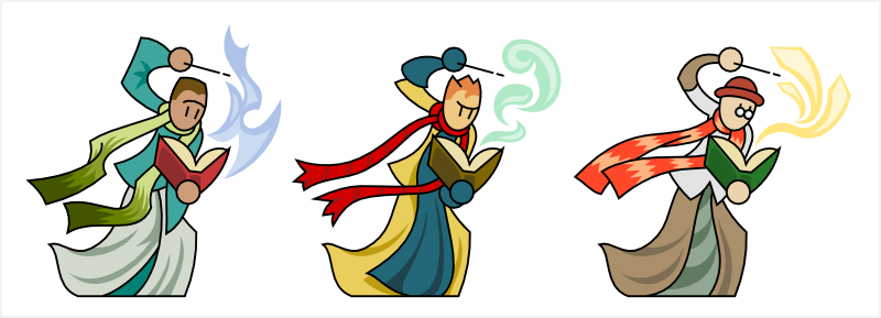
I'm sticking with doing vector colouring/shading, and I made the linework for these with that in mind. So I knew I'd be putting a coloured pattern on the scarves, and that I could demarcate #1 and #2's hair without needing to blackline it. Which is new. I used the "spare" lines left in the budget to put a little more expression on their faces. Not sure about that. I wonder if it would be better to do it on the shading layer. I think it's only a matter of time before I give up on the no-mouth line-eyes look. Style erosion.

The unlined spell effects are also new and I can see myself doing a lot more things along those lines. For these guys I deliberately avoided any sort of elemental theming. #1 has flames, yes, but they're blue so they're passable as a generic magical effect.

Next there's these satyr things. I had something else in mind while sketching, but the drunken faun is far more interesting to me. Very fond of the various boozes and goat-beards. The horns were an enormous pain in the arse. One of the downsides of vector colouring - that horn texture would have been much easier in photoshop.

I think these satyrs are knights who have gone questing into the woods and been cursed for their unchivalric vices. In this case, the knights were drunkards. I could easily conceive of gluttonous pig-monsters and maybe slothful bear-men?

These cursed knights would fill a good niche in the theoretical game these are never going to be used for. I didn't feel like the forest witches were actually evil. Cursed monsters gives you something you can feel good about fighting, also making the witches more of a credible menace without making them evil.

Monday, 7 September 2009

"...so he got up and left."

I wasn't sure if "mesmerist" was a word, but there you have it. "Telepathist" too. Telepathist! I must find an excuse to use that word.In the meantime: hypnotisers (not a word).

I'm trying a quick+easy metallic effect here. Pure white with 50% transparency. It looks... well, it looks quick and easy. Not offensive to me though and I might get better at it in the future.

I'm sure I was thinking interesting things while I made these guys, but buggered if i can remember any of it. Erm, I like #3's lampshade-hat. Also his crystal.

#1's coattails are meant to be hanging behind his legs, not over them. Not sure whether that's obvious. Wow, I am exceptionally boring today. "Ooh I likes the shiny thins and also the lampshade."

Sod it, I'm going to go find some biscuits.

Thursday, 11 June 2009

Flashy

I decided at the last minute that these generic floaty wizards were lightning-themed. It's not really reflected anywhere on them except their staffs, and I imagine those are far from obvious to people who aren't me.

But that's ok. They're not lightning-themed wizards, they're wizards who specialise in lightning. They'll do fine as part of the university, or as generics otherwise.

They're not the first floaty characters I've done, but it's still a nice way to get a novel pose. Fixes the flatfoot problem too.

I did something unusual here; they each have one minor interchangeable detail. From left to right, gloves, boots and trousers. I didn't want all three to have (say) different styles of gloves, and trivial boot variations are getting really hard for me. So! Different detail area for each and they're all swappable. I suppose I could put them all on the same character, but I can't see much gained from that. I'll probably do more of this kind of thing when I can. It seems like it'll help make variations look more like individuals.

Colours were a pain to do. They're ncie and vivid at least. Possibly too vivid in places. I can't imagine I won't redo them at some point. But not now.

Idea in progress: cyber-surgical hulk.

Tuesday, 19 May 2009

Grimm

More for the university. Librarians. Or possibly teachers (or even students!) with a textbook. They're very tall and with little dynamism. I wondered whether I should give them cats to fill out the frame - both as wizardly familiars and because everyone knows that libraries like to have a pet cat. I may yet.

I apologise for how boring the colouring job is here. I don't dislike these bookmen, but they don't particularly inspire me either. Filler again I suppose.

I'm glad that I was able to get three different book-holding poses. Especially #2's. Since it's really the book that is the focus, I used the simplistic wand technique I described before. Which reminds me - turns out I was wrong about how exciting eyebrows were. One of the woodsmen had them, albeit single lines with no volume.

Maybe if I use the house colour schemes method I'll be able to approach these a bit more vigorously. As is they're really rather mundane. The puppeteers were far more fun. Flamboyant costumes, cute puppet poses and bright colours.

Somehow the colours left #3 looking like Revolver Ocelot from MGS3. The effect is not entirely unpleasant, if not exactly what I had in mind when I did the linework.

These seem too fun to be dismissed as generics, but I don't yet have a proper home for them. i suppose if I had enough ideas i could do a carnival or circus set. I have a juggler I could wheel out, and a jester/fool type would be easy. Lion tamer too maybe? But evil clowns is not a trope that has ever gained any traction with me. Perhaps I'll stay away from anything circus-like and have them - along with the juggler - be street performers as part of a "city" set along with the thugs and thieves. That might work. I'd still want to do a fool though - he could be part of the chivalry/joust set to provide a bit of contrast with all those knights.

Saturday, 16 May 2009

Wizards too!

By some coincidence, I've not done any magicy-types since I started drawing these guys in triplicate. That run has been interrupted.

I labeled these guys "instructors" for want of a better name. And because something about them makes me think "magic school". That could be an explorable new theme, or they could just as well be generic hero-types.

The poses are pretty boring - facing the camera and largely symmetrical - but I like them enough to ignore that. The high-collared cloaks please me. Really, that was the hook for the initial sketch and I'm glad i could reproduce it for the final linework. The scepters with floaty elements too - I like free-floating parts for magical implements. It's a nice simple thing I can do that adds a lot of interest. Also the hair on #1 and #2. #1's a new way of drawing hair that I experimented with; wispy and messy. I do not dislike it. And #2's silly old man hair worked out nicer than I'd hoped with a very low nodecount.

If I do decide that these are going to be magic school instructors, I'd probably re-colour them to make the cloak look like a uniform. In fact with a large enough pool of magic school characters, I could use multiple colour themes and divide them into houses. That could be cool. Something to think about if I go down that route. But like I said they could also be generics. Robed wizards in general are seldom heavily themed. Like this next batch:

Again, they could be part of the magic school (wand studies perhaps?) or generics. Note the floaty bits on the wands again.

Way back when I started playing with these not-really-stick figures, I came up with a nice way to do wands with a minimal line count. Just a straight line, with a break in it near the top to indicate the white part. I didn't use it for these guys since I wanted to emphasise the wands a bit more, but it'd be good on figures where the wand is incidental or secondary.

Not that I went all out on these wands. What is that, a marshmallow? Then some kind of crystal and a cliché star. The magic school approach would at least justify a lot of cliché. #3's hat for example.

One characteristic of robed wizards is that it's tricky to come up with meaningful variations for the main body without totally wrecking what made the original cool to me. See, they tend to be all one big shape. That's why the three here all have the same, err, don't have the words... "swooshy bits", down the front from the collar. Also, if I do come up with meaningful variation, it has to be swapped out all as one piece. So if I tried to swap parts between these guys, I'd treat the arms and body separately, so any of the robe styles could have sleeves, cuffs or gloves. Probably the shoes too, just to try and break pattern. Now that i look at them again, I wonder if I could swap hats/hair independent of heads... #3's lock might overlap #2's eyebrows in a less-than-attractive way though.

Oh yeah - #2! I want to point out that he's sporting an unprecedented new feature - eyebrows! I don't think I've done those elsewhere. The odd frown line, yes. But not distinct eyebrows. I think. Unless I did them on that old calligrapher or the minister of thamaturgy... I'm going to go check.

Nope! No eyebrows in the archives. This is a bold new advance in veep technology.